
This week I had the opportunity to search for and observe various designs though the eyes of the design elements document.
The first design element I found was Typography in this adorable invitation for a baby shower hanging on my fridge.

I thought this was the perfect example of typography as it used multiple styles of fonts and colors as part of it’s design. The top part of the invitation is all in serif font with the words “Baby Girl” significantly larger than the rest of the text. I’ve cut off the details of the location and time of the party, but you can see that the text below the words “Baby Girl” are small and sans serif, a nice contrast to the more general information above. I also loved the use of color against a dark background to provide a unique take to a baby shower for a girl. Our attention is drawn to the fact that our friends are having a baby girl without the invitation having to be pastel pink with images of rattles and strollers.
The second design element I found on my safari was Rhythm in the poster below. I didn’t actually take this picture, but rather found it on Pinterest on what I think is a Japanese blog.
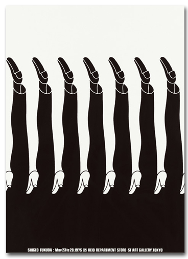
I’m not sure the context around this poster since the blog is all in Japanese, but I did think it was an excellent portrayal of Rhythm and most of the Principles of Design. This poster demonstrates both repetition and the alternation of elements. The way the legs flow in and out of being a male or female leg in the mind force the viewer to take a second to pause to contemplate the image. It establishes a pattern using bold and contrasting black and white, perhaps indicating the uniformity of men and women in society or demonstrating the stark contrast between them.
The third design element I found was Minimalism and Use of Space.

This is a book cover for a book called The Story. The cover uses a simple white background, limited text, and one symbolic image to illustrate it’s point. The book is based off of the Bible which is well known for having a long and somewhat confusing history, so I think it was a smart design choice to keep this book cover simple and minimalist. I am personally a huge fan of white space and think it adds a lot of power, and can evoke many emotions when used in design.

I agree with your point regarding the power of white space. This is effectively illustrated in your third photo. I don’t think I would have noticed the crown of thorns shadow if there were other text or graphics on the book cover. The minimalist design maximizes the impact here.
You did a great job with your design postings! I love the picture of the “Rhythm”. Not only does it literally represent dance & rhythm but the layout and design have a rhythmic effect on the eye with seeing the male and female legs! Great work!
I also love the rhythm picture! When I think of rhythm, I think of music. However, this gave me a totally different perspective and that’s always a good thing 🙂
Pingback: Stories Have Taken Over | aprilshowersmayflower